The creation of GlowSip
*
The creation of GlowSip *
The process of GlowSip
GlowSip is a premium, collagen-infused beverage brand designed to promote hydration and skin radiance. The branding focuses on soft, fresh, and modern aesthetics to appeal to health-conscious consumers.
To visualize the brand, I created a mockup in Adobe Photoshop, placing the logo and color palette on a sleek can design. The final composition highlights how GlowSip’s branding comes together cohesively, making it ready for real-world application.
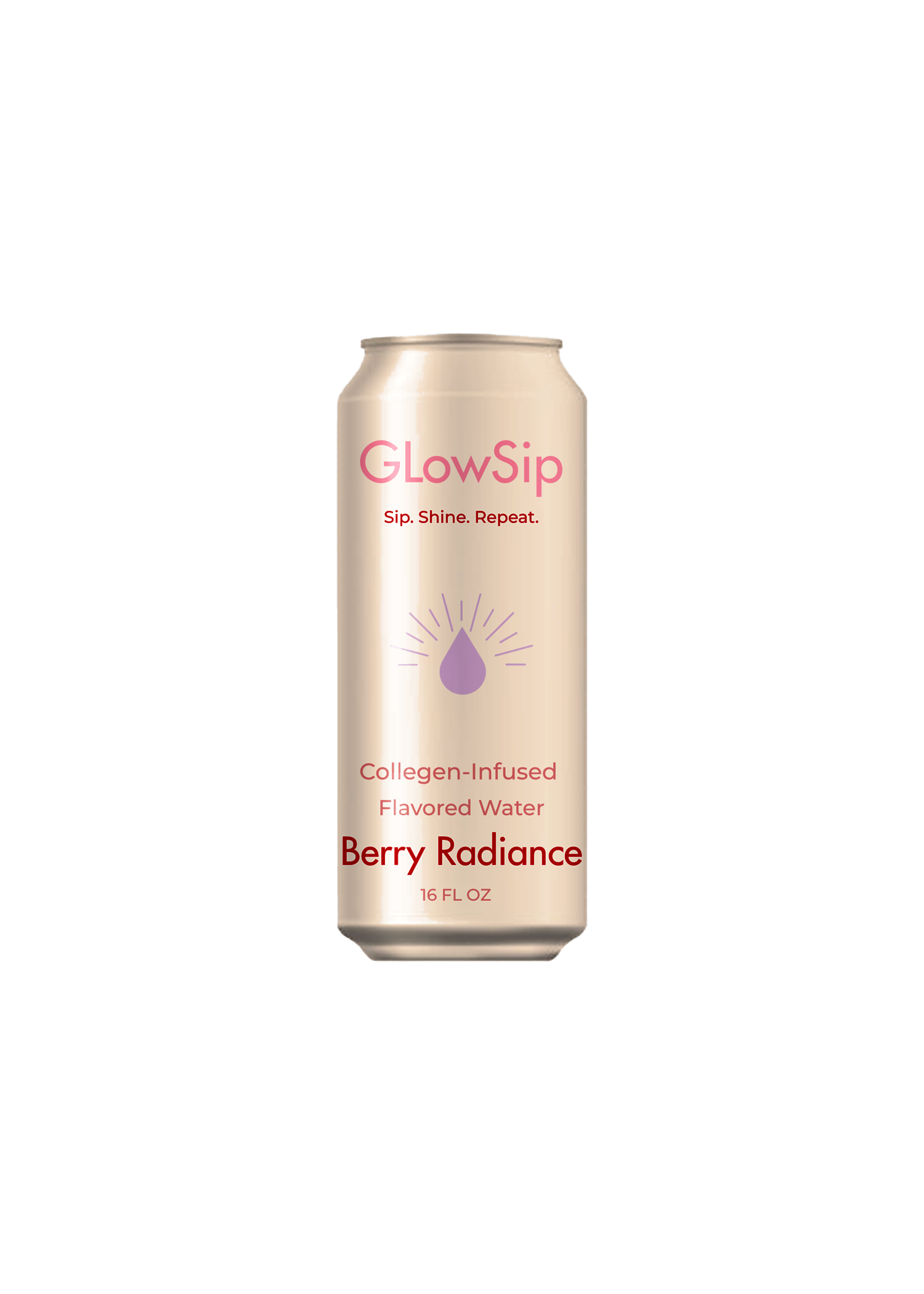
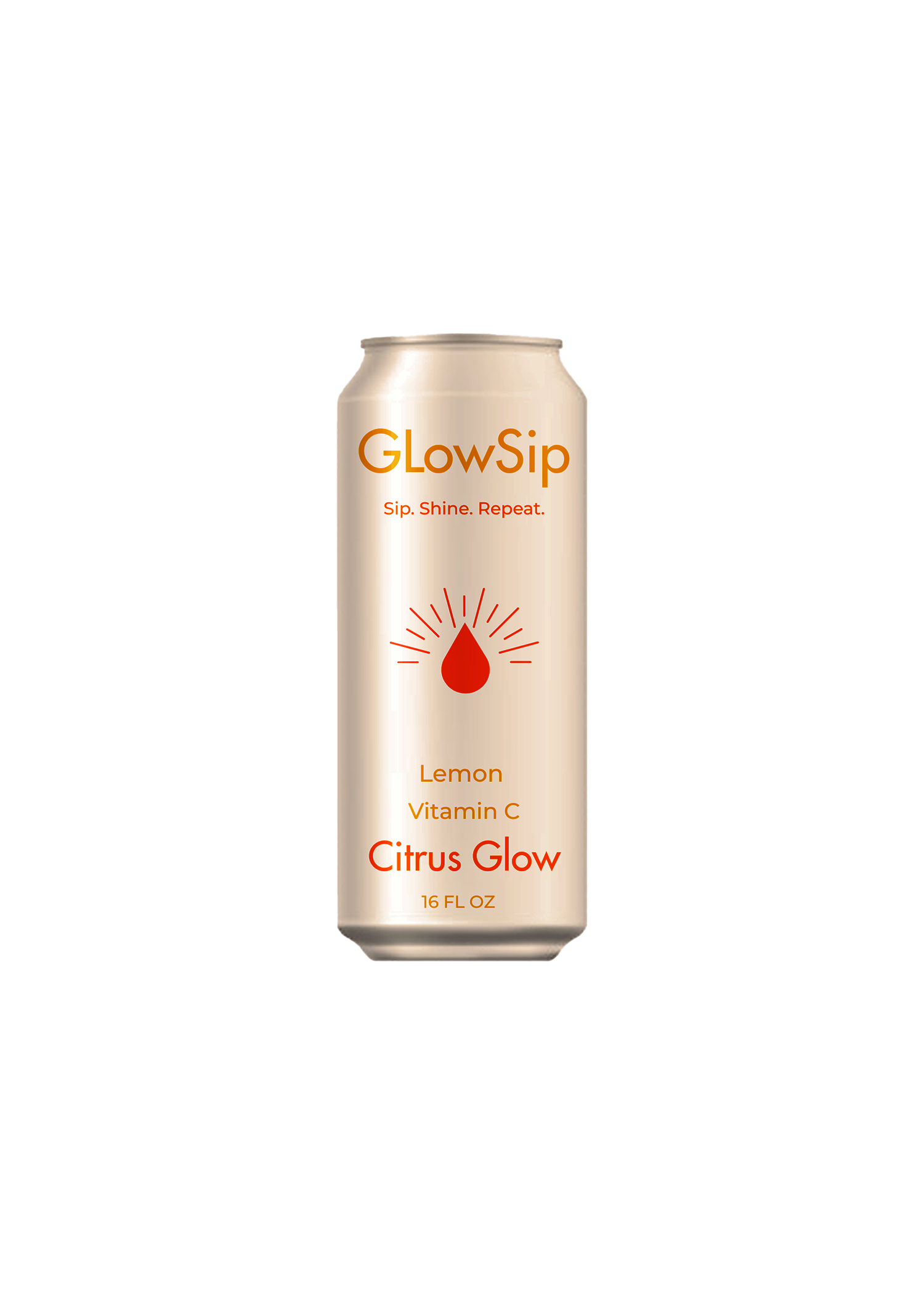
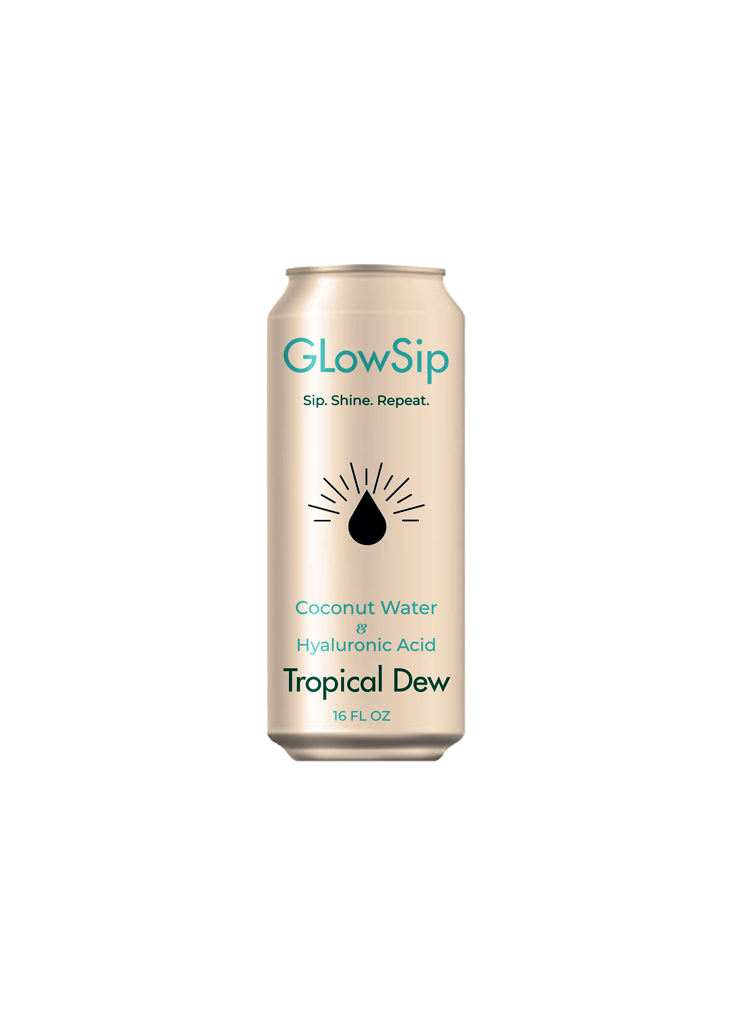
Font Choice: I selected Montserrat and Futura for their clean, modern, and elegant feel, which aligns with GlowSip’s premium yet approachable identity. It gives the brand a friendly touch while maintaining sophistication.
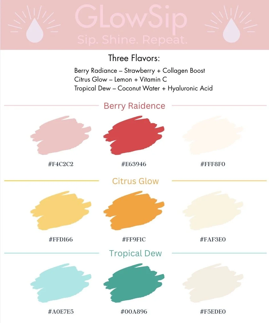
Color Palette: The colors were inspired by the natural ingredients in each flavor:
Berry Radiance – Blush pink & rose red for a soft, vibrant feel.
Citrus Glow – Sunshine yellow & warm orange for an energizing look.
Tropical Dew – Cool aqua & soft teal to reflect hydration and freshness.
The neutral shades help balance the vibrancy, ensuring a minimal and high-end aesthetic.